import matplotlib.pyplot as plt
import pandas as pd

# array of decision alternatives
decisionArray = ["A","B","C","D","E"]
# satisfaction value with each alternative
satisfactionArray = [3,5,4,3,1]
# code the best decision with a prominent color
# and the other decisions with boring grey
# see named colors here: https://matplotlib.org/stable/gallery/color/named_colors.html

# highlight the max utility decision, grey-out other decisions
bestUtility = max(satisfactionArray)
colorArray = ["darkorchid" if utilityVal == bestUtility else "lightgrey" for utilityVal in satisfactionArray]
## above gives: colorArray = ["lightgrey","darkorchid","lightgrey","lightgrey","lightgrey"]

## plot the results using matplotlib object-oriented interface
fig, ax = plt.subplots(figsize = [5,3.5], layout = "constrained")
ax.bar(x=decisionArray, height=satisfactionArray, color = colorArray)
ax.set_xlabel("Decision Alternative")
ax.set_ylabel("Utility")
ax.set_title("Decision B is the Best Alternative")
plt.show()4 The Four Stages of Visualization
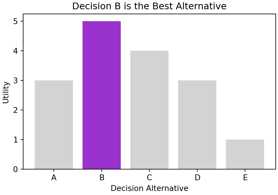
Let’s start this chapter with an unrealistic ideal scenario. Imagine every possible decision has a single quantifiable and certain outcome by which satisfaction is measured. We can imagine the codification of this scenario as follows:
To create a figure as compelling as Figure 4.1, one progresses through four main stages of visualization:
The four main stages of visualization presented in this chapter are inspired by Noah Ilinsky’s “Designing Data Visualizations”. See his 2012 LinkedIn Tech Talk here: https://youtu.be/R-oiKt7bUU8.
- Declaration of Purpose
- Curation of Content
- Structuring of Visual Mappings
- Formatting for Your Audience
4.1 Stage 1: Declaration of Purpose
ALICE: “Would you tell me, please, which way I ought to go from here?”
CAT: “That depends a good deal on where you want to get to.”
ALICE: “I don’t much care where–”
CAT: “Then it doesn’t matter which way you go.”
― Lewis Carroll, Excerpt for Alice in Wonderland.
As consumers of Figure 4.1, we can easily discern the intention of the plot maker, they obviously are stressing that “Decision B” is their recommendation. Let’s briefly extract two key lessons from how this is accomplished:
- The title of the plot boldly conveys a recommendation, “Decision B is the Best Alternative.”
- Color draws the eye towards important parts and away from the less important parts; Figure 4.1 shows excellent use of grey to present less important parts.
4.2 Stage 2: Curation of Content
“If all you have is a hammer, everything looks like a nail.” - Abraham Maslow, The Psychology of Science
Given the intention of a plot, acquire or make all the data you need to describe the visual elements of your plot. Notice this line in the code for Figure 4.1,
colorArray = ["darkorchid" if utilityVal == bestUtility else "lightgrey" for utilityVal in satisfactionArray]which uses list comprehension to make an array of colors that draws attention to the decision that maximizes utility. This data did not exist, it had to be made. NEVER limit yourself to the given data, make or acquire all the data you need to fulfill your purpose.
4.3 Stage 3: Structuring of Visual Mappings
“To make a statistical graphics system, we need to map qualitative and quantitative scales to sensory aspects of physical stimuli. Each dimension of a graph must be represented by an aesthetic attribute such as color.” - Leland Wilkinson, Chapter 10 of The Grammar of Graphics.
matplotlib has two interfaces, a procedural interface and an object-oriented interface. We exclusively use the object-oriented interface where a graph gets defined by the attributes of a Figure object and the attributes of one or more Axes objects. Figure object attributes contain properties of the canvas we are drawing on, most notably the size of the canvas that will contain our graphics. Axes object attributes are where the real-work gets done. Most of what we seek to do is an intelligent mapping of data to Axes attributes to yield an informative graphic or plot. This mapping involves three inter-related components: 1) the choice of geometry like point, line, or bar, 2) the mapping of data to desired aesthetics like position, color, or shape, and 3) the use of facets which create many little similar graphics that often vary only on the way data is filtered for each individual graphic. We elaborate on these three components of a graphic below.
In developing this chapter, we are using some of the language from the grammar of graphics. This grammar was formalized in the lengthy and terse work of Wilkinson (2006) and popularized in Wickham (2009). Our goal in using the grammar is less ambitious; we only focus on the mapping of data to visual markings that appear on a graph. More details can be seen in this 2019 video of Leland Wilkinson: https://youtu.be/1X93Sum_SyM.
Wilkinson, Leland. 2006. The Grammar of Graphics. Springer Science & Business Media.
Wickham, Hadley. 2009. Ggplot2 Elegant Graphics for Data Analysis. Springer-Verlag New York. http://ggplot2.org.
4.3.1 Geometry and Aesthetics
Geometry is a category of visual marking. To limit the scope of our discussion, let’s restrict ourselves to three geometries, point, line, and interval (e.g. bar graph). Aesthetics are the stimuli that our visual system responds to like position, size, shape, and color. It is by mapping our data to these stimuli and a geometry that graphics are produced. Figure 4.1 used interval geometry and these aesthetic mappings:
Notice, the matplotlib code uses arguments and keyword arguments for various aesthetics. Use the help documentation to discover what is possible: https://matplotlib.org/stable/api/_as_gen/matplotlib.axes.Axes.bar.html.
Different choices for geometries and aesthetic mappings lead to different graphics. Here is a set of less compelling choices used to make Figure 4.2:
# highlight the max utility decision with a star shape
shapeArray = ["*" if utilityVal == bestUtility else "o" for utilityVal in satisfactionArray]

## plot the results using matplotlib object-oriented interface
fig, ax = plt.subplots(figsize = [4.5,3], layout = "constrained")

## marker argument in ax.scatter does not accept an array... ARGH!
## workaround:  use for loop to plot each point
for satis, dec, col, shape in zip(satisfactionArray, decisionArray, colorArray, shapeArray):
    ax.scatter(x=satis, y=dec, color = col, marker = shape, s = 400)

ax.set_xlabel("Utility")
ax.set_ylabel("Decision Alternative")
ax.set_title("Decision B is the Best Alternative")
ax.invert_yaxis()
plt.show()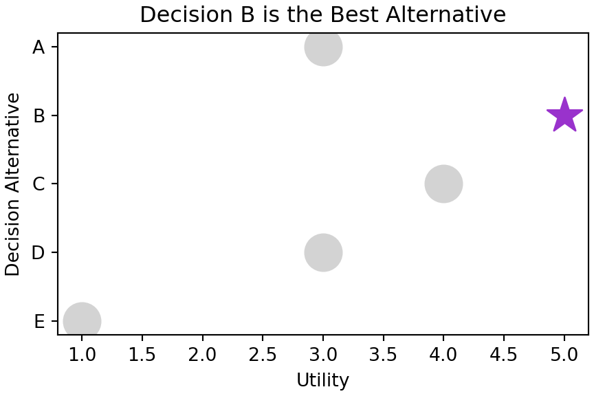
Note that the s = 400 argument is not an aesthetic mapping. Rather a constant value is supplied for the size argument to ax.scatter so that every point is made bigger. Consider this an overriding of the default point size property as opposed to a mapping of data to aesthetic.
Axes.bar(), Axes.barh(), and Axes.scatter() are the code equivalent of these geometries: vertical bar chart, horizontal bar chart, and scatterplot, respectively. These implementations of geometry types in matplotlib are the workhorses of my visualization efforts. In terms of aesthetic mappings, two main characteristics of the data determine the likely suitability of any aesthetic. The two are :
- Ordinality: Ordinal data, or ordered data, is data that can be sorted along a dimension. As examples, numerical data can be sorted along a number line, text labels can be sorted alphabetically, and some survey scales (e.g. “Mostly Agree”, “Slightly Agree”, “Neutral”,“Disagree”) can be sorted along a more qualitative dimension like agreeability or favorability. Visual encodings that reflect order include positioning, length, and size, but usually do not include color or shape where it is not obvious that green is better than yellow, or squares are larger than circles. Sometimes though, you can use color when the context is obvious - for example, green is often associated with a profit and red with a loss.
- Cardinality: Cardinality of a data column is the number of distinct data values in a column. Cardinality indicates how many distinct values can be represented by the encoding. For example, humans can easily distinguish 10 carefully chosen colors from one another, but it is impossible to choose twenty colors where each is easily distinguished from all others. Hence, color is only a good encoding for data with only a handful of unique values (e.g. gender, responses to yes/no questions, car manufacturer, etc.). Position on the other hand could be a good encoding for real-valued numbers as very small changes in position are detectable by the human eye. In contrast, something like the angular change of a line could also represent a real-valued number, but cannot be used with alot of data as small changes in angle are hard to detect.
To see how to choose which aesthetics to map to different types of data, read through the below table specifying the ordinality and cardinality appropriate for each aesthetic:
aesthetic |
Handles Ordinal Data | Max. Cardinality | Notes |
|---|---|---|---|
x- or y-postion |
Infinite | Most powerful aesthetic. Use it for your most important data. Handles infinite data and small differences in data are easily detected by the human eye. | |
color for discrete data |
no | < 12 | Use color to map data to the color of points or to map data to the color of a bar. This is another powerful aesthetic to use - you just need a data column of unordered data with not too many distinct values, i.e. categorical data. |
color for continuous data |
depends | Similar to above excepts mappings of values to colors will change the hue, not the actual color. So numerical data might have small numbers mapped to a dark blue color and large numbers mapped to a lighter shade of blue. | |
alpha (i.e. transparency) |
a few | Use alpha to map transparency of points to numerical data. Less important points/bars can be made more transparent. This aesthetic is often better mapped to a constant. Useful for overplotting lots of points on top of one another. |
|
marker |
no | <12 | Use marker to map a few different categorical (unordered) values to different point types, i.e. circles, squares, triangles, etc. |
s or size |
<12 | Use s to map data values to the size of the points. Since small differences in size, say of a circular point, are not easily detectable by the human eye, use this aesthetic when you seek to reveal only large differences in your numerical data. |
4.3.2 Facets
For our purposes, facets are sets of individual graphics composed from a single graphic’s geometries and aesthetic mappings. Each little graphic is called a facet and will vary mostly in what data gets displayed. Figure 4.3 shows two facets created using the geometry and aesthetics of Figure 4.1.
# assume decision alternatives are regional.  A & B are east region,
# possibilities and C, D, & E are west region possibilities
regionArray = ["East","East","West","West","West"]
# use dataframe to create rows of observations for the three variables
# this will allow us to create separate groups for each region
plotDF = pd.DataFrame({"decision": decisionArray,
             "satisfaction": satisfactionArray,
             "region": regionArray})

# set y-axis limits prior to grouping using all data
ymin, ymax = (0, max(plotDF.satisfaction)+1)

# create a Groupby object with grouping by region
groupedRegionDF = plotDF.groupby("region")

# create figure to have one subplot (i.e. facet) per region
fig, axs = plt.subplots(ncols = len(groupedRegionDF),
                        figsize = [8,3.5],
                        layout = "constrained",
                        sharey = True) ## use same y-axis limits for all facets

idx = 0  # initialize index to reference each plot
# use a for loop to create each facet; idx is index of facet
for region, groupDF in groupedRegionDF:
    # highlight the max utility decision, grey-out other decisions
    bestUtility = max(groupDF.satisfaction)
    colorArray = ["darkorchid" if utilityVal == bestUtility else "lightgrey" for utilityVal in groupDF.satisfaction]
    ## above gives: colorArray = ["lightgrey","darkorchid","lightgrey","lightgrey","lightgrey"]

    axs[idx].bar(x = groupDF.decision, height = groupDF.satisfaction, color = colorArray, width = 0.8)
    axs[idx].set_xlabel("Decision Alternative")
    axs[idx].set_ylabel("Utility")
    ### get label(s) for best decision
    bestDecIndex = groupDF.satisfaction.idxmax()
    bestDecLabel = groupDF.decision.iloc[bestDecIndex]
    ### set the title
    axs[idx].set_title("Region: " + region + "\nDecision " + bestDecLabel + " is the Best Alternative")
    idx = idx + 1

fig.suptitle("Best Decision for Each Region")
plt.show()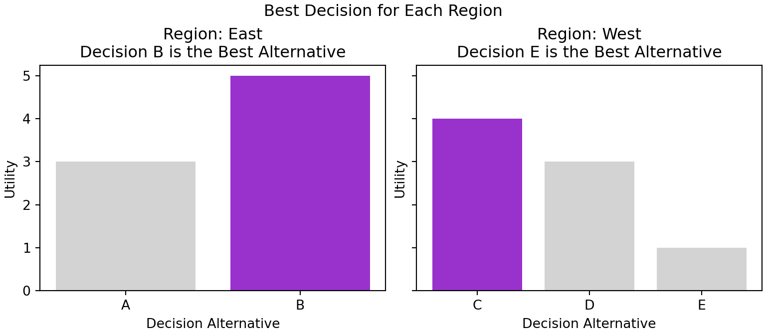
See the help documentation for creating multiple subplots here: matplotlib.org subplots demo
The splitting of the single graphic of Figure 4.1 into the two facets of Figure 4.3 is done using arguments to matplotlib’s subplots function. The subplots function - when supplied with the nrows argument, the ncols argument, or both arguments - splits the canvas (i.e. fig) into a grid consisting of the number of specified rows and columns. Each part of the grid gets its own Axes object which we use to create individual graphics; the index of our Axes object, e.g. idx in axs[idx], is used to say which part of the grid is being referenced. Above, axs[0] refers to the first column in the row and axs[1] is the second column; if a multi-row, multi-column index is required, axs[rowIndex,colIndex] specifies the Axes object to modify with axs[0,0] being the upper-left grid location. Without any row or column arguments, subplots returns a single Figure and single Axes. With row and/or column arguments supplied, subplots returns a single Figure object and an array of Axes objects.
4.4 Stage 4: Formatting for Your Audience
The last stage of data visualization is formatting. In exploratory data analysis, the work on this step should be minimal. However, once you go beyond exploration and your visualization is to be shared, then you should spend considerable time formatting your work to be persuasive. There is always a little productive struggle required to get things perfect, so bring your patience and perseverance to this step. Also, get ready to cruise the Internet and the matplotlib help documentation to get things just the way you need it.
Here is nice simple code that stage 3 of your data visualization might yield; its good enough for you, but not strong enough for your audience:
fig, ax = plt.subplots(figsize = [4.5,3], layout = "constrained")
ax.bar(decisionArray, satisfactionArray)
plt.show()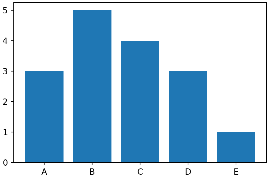
The output shown in Figure 4.4 reflects minimal formatting.
Now, for audience consumption, we start the long process of tweaking out graphic.
4.4.1 Titles and Axis Labels
The easiest fix to ensure your audience gets the message of your visualization is to add a title. The title should be the message, not just a description of the plot. The labels should be human readable. Both titles and labels use the set_foo() methods of an Axes object.
fig, ax = plt.subplots(figsize = [4.5,3], layout = "constrained")
ax.bar(decisionArray, satisfactionArray)
ax.set_title("Decision B is the Best Alternative")
ax.set_xlabel("Decision Alternative")
ax.set_ylabel("Utility")
plt.show()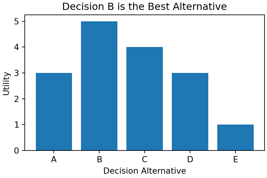
4.4.2 Color Coding With Automatic Legend
There are many ways to create a legend in matplotlib. Here is the one way that tends to work best for me. Every time I introduce a geometry (e.g. Axes.bar or Axes.scatter), I supply a label argument and assign the output to a handle or pointer to that geometry. In the code below, the handles are reco, unwise, and best. Then, a call to ax.legend with the handles argument yields a pretty good legend for the geometries we drew (see Figure 4.6).
fig, ax = plt.subplots(figsize = [5,3.5], layout = "constrained")
ax.set_title("Decision B is the Best Alternative")
ax.set_xlabel("Decision Alternative")
ax.set_ylabel("Utility")

## add color with legend - use label argument to get automatic legend labels
## key is to not plot arrays of geoms, rather plot each geom separately in loop
bestUtility = max(satisfactionArray)
for decision, satisfaction in zip(decisionArray, satisfactionArray):
    if satisfaction == bestUtility:
        reco = ax.bar(decision, satisfaction, color = "darkorchid", label = "Recommended")
        ax.scatter(decision, satisfaction/2, color = "white", marker = "*", s = 400)
    else:
        unwise = ax.bar(decision, satisfaction, color = "lightgrey", label = "Unwise")
ax.legend(handles = [reco, unwise])  ## uses label argument
plt.show()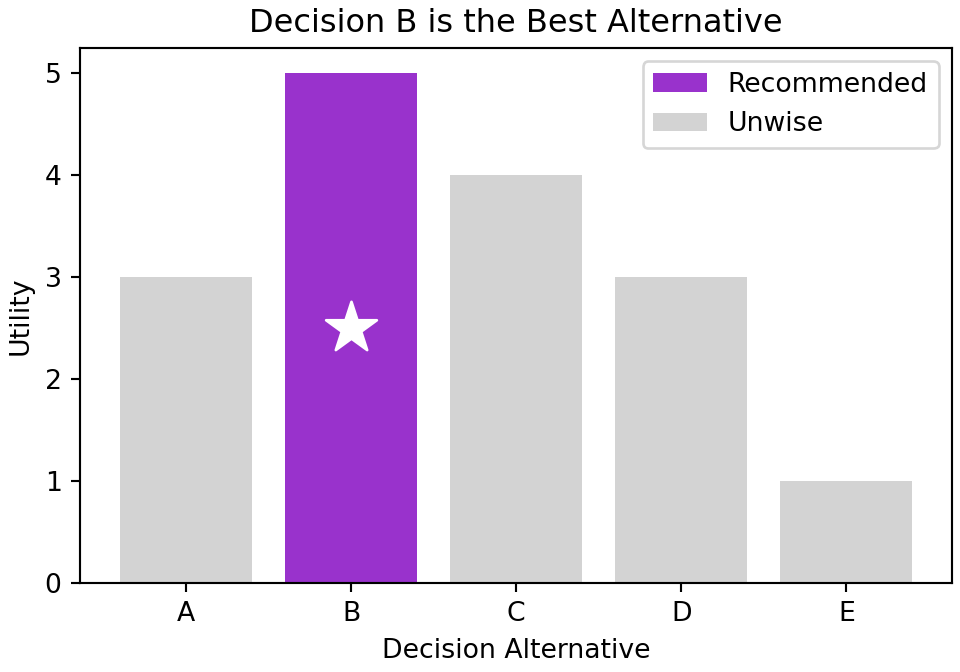
4.4.3 Annotate
We have already seen the how titles and colors aid our audience to get the right message from our visualization. Another useful tool for communicating with our audience is annotation. We can simply add text with an arrow to our graphic if there is something we want to make sure our audience thinks about.
If you google matplotlib annotate, you may end up seeing matplotlib.pyplot.annotate or matplotlib.axes.Axes.annotate. The first does not use the object-oriented interface that we prefer; in general, we will do most of our work calling the object-oriented methods available on an Axes object. and as such, the right documentation can be found here matplotlib.axes.Axes.annotate documentation.
Here is an example of doing that:
fig, ax = plt.subplots(figsize = [5,3.5], layout = "constrained")
ax.set_title("Decision B is the Best Alternative")
ax.set_xlabel("Decision Alternative")
ax.set_ylabel("Utility")
bestUtility = max(satisfactionArray)
for decision, satisfaction in zip(decisionArray, satisfactionArray):
    if satisfaction == bestUtility:
        reco = ax.bar(decision, satisfaction, color = "darkorchid", label = "Recommended")
        best = ax.scatter(decision, satisfaction/2, color = "orange", marker = "*", s = 300, label = "Best Alternative")
    else:
        unwise = ax.bar(decision, satisfaction, color = "lightgrey", label = "Unwise")
ax.legend(handles = [reco, unwise, best])

### NEWLY ADDED LINE FOR ANNOTATION IS BELOW
ax.annotate(text = "Consider Decision C if sustainability\nis important.  Utility did not include\nsustainability in its calculation.",
            xy = ("C",3.5), xytext = ("D",1.2),
            horizontalalignment='center',
            arrowprops = dict({"arrowstyle": "->"}))
plt.show()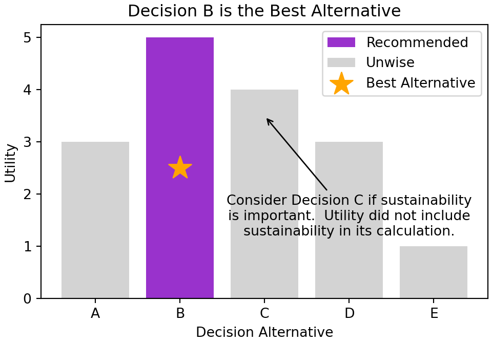
4.5 Getting help
Some additional resources include Wes McKinney’s Python for Data Analysis as well as the matplotlib documentation at https://matplotlib.org/stable/users/index.html.
4.6 Questions to Learn From
Exercise 4.1 The following code makes a dataset about penguins available to you:
import seaborn as sns
## load dataset
penguins = sns.load_dataset('penguins')
## get number of unique values for each column
penguins.nunique()
List all columns with cardinality under 12. Of these columns, which data are suitable for mapping to the color (discrete) aesthetic because they are NOT ordinal data?
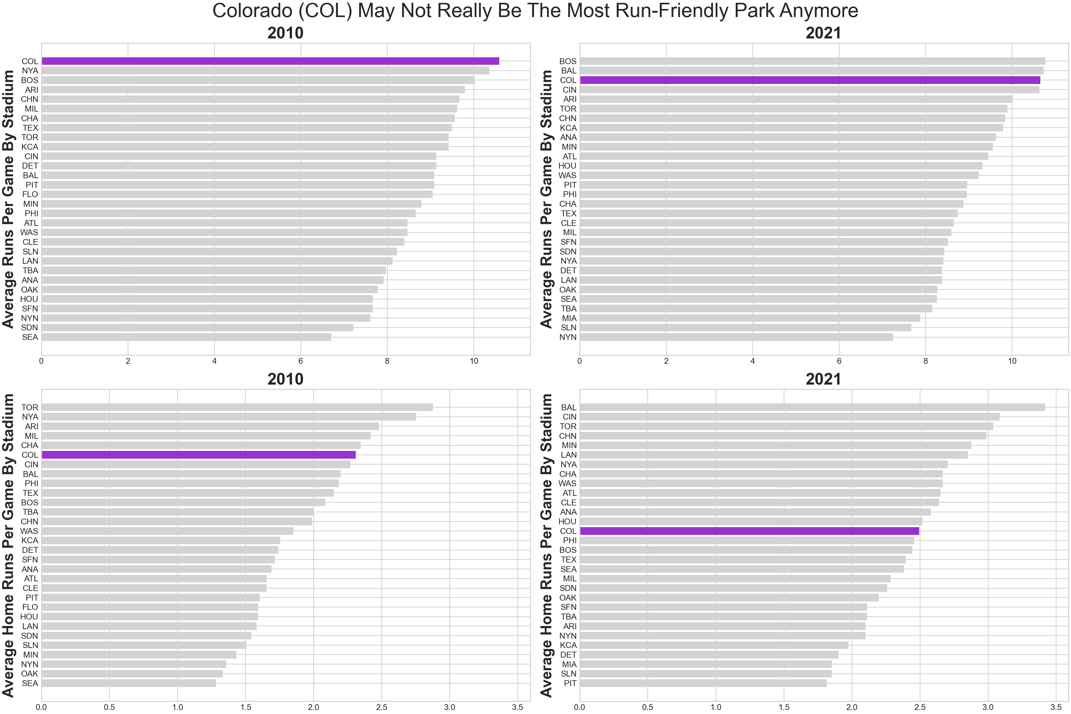
Exercise 4.2 According to Wikipedia, Coors Field is a baseball stadium in Denver, Colorado with a reputation for being a home-run friendly baseball stadium:
At 5,200 feet (1,580 m) above sea level, Coors Field is by far the highest park in the majors… Designers knew that the stadium would give up a lot of home runs, as the lower air density at such a high elevation would result in balls traveling farther than in other parks. To compensate for this, the outfield fences were placed at an unusually far distance from home plate, thus creating the largest outfield in Major League Baseball. In spite of the pushed-back fences, for many years Coors Field not only gave up the most home runs in baseball, but due to the resultant large field area, the most doubles and triples as well.
Use the following code to 1) retrieve the number of home runs scored by the visiting and home teams for every game played during the 2010 and 2021 seasons, and 2) create averages by stadium for each year.
# !pip install matplotlib --upgrade
import matplotlib.pyplot as plt
import pandas as pd
import numpy as np

## get 2010 baseball season data - source: https://www.retrosheet.org/gamelogs/index.html
df2010 = pd.read_csv("https://raw.githubusercontent.com/flyaflya/persuasive/main/baseball10.csv")

## get 2021 baseball season data - source: https://www.retrosheet.org/gamelogs/index.html
df2021 = pd.read_csv("https://raw.githubusercontent.com/flyaflya/persuasive/main/baseball21.csv")

## aggregate data to get average homeruns and runs per
## game by "Home" stadium and by year

avgDF2010 = (df2010
    .assign(totalHR = lambda df: df.visHR + df.homeHR)
    .assign(totalRuns = lambda df: df.homeScore + df.visScore)
    .drop(columns = ['date','visiting'])
    .groupby(['home'], as_index=False)
    .mean()
)
avgDF2021 = (df2021
    .assign(totalHR = lambda df: df.visHR + df.homeHR)
    .assign(totalRuns = lambda df: df.homeScore + df.visScore)
    .drop(columns = ['date','visiting'])
    .groupby(['home'], as_index=False)
    .mean()
)
Create a well-formatted four-facet plot (i.e. four subplots in one matplotlib figure) with the following mappings to show the change in average total runs per game and average home runs per game by stadium.
Your final plot might look something like Figure 4.8.
The following rubric (no partial credit) is recommended for grading:
- (0.5pt) Create at least one of the four subplots with correct data shown as a horizontal bar chart (formatting not necessary).
- (0.5pt) All created plots, whether one or four, have proper sorting of the stadiums on the y-axis.
- (0.5pt) All created plots, whether one or four, show Colorado as
darkorchidand all other stadiums aslightgrey. - (0.5pt) All created plots, whether one or four, have clear axis labels, titles, and a suptitle that spans both columns.
- (0.5pt) Four plots are created on one figure and the figure is a near 60%+ match in terms of formatting of the figure seen in Figure 4.8. Data and interpretability should be 99%+ match.
- (1 pt) Four plots are created on one figure and the figure is a near 90%+ match of the figure seen in Figure 4.8. Data and interpretability should be 99%+ match.
Submit your homework as a .ipynb file.