
10 Posterior Predictive Checks and Other Diagnostics
Cobra snakes are known for hypnotizing their prey. Like cobras, Bayesian posteriors can fool you into submission - thinking you have a good model with small uncertainty. The seductiveness of getting results needs to be counter-balanced with a good measure of skepticism. For us, that skepticism manifests as a posterior predictive check - a method of ensuring the posterior distribution can simulate data that is similar to the data observed. We want to ensure our analysis leads to actionable insights, not intoxicating and venomous results.
When modelling real-world data, your generative DAG never captures the true generating process - the real-world is too messy. However, if your generative DAG can approximate reality, then your model might be useful. Modelling with generative DAGs provides a good starting place from which to confirm, deny, or refine business narratives. After all, data-supported business narratives motivate action within a firm; fancy algorithms with intimidating names are not sufficient on their own. Whether your generative DAG proves successful or not, the modelling process by itself puts you on a good path towards learning more from both the domain expertise of business stakeholders and observed data.
10.1 Revisiting The Tickets Example
Last chapter, we were modelling the daily number of tickets issued in New York City on Wednesdays. We made a dataframe, wedTicketsDF, that had our observed data using the code shown here:
import pandas as pd
url = "https://raw.githubusercontent.com/flyaflya/persuasive/main/tickets.csv"
ticketsDF = pd.read_csv(url, parse_dates = ["date"])
wedTicketsDF = (
    ticketsDF
    .assign(dayOfWeek = lambda DF: DF.date.dt.day_name())
    .where(lambda DF: DF.dayOfWeek == "Wednesday")
    .dropna()
    .groupby("date")
    .agg(numTickets = ('daily_tickets', 'sum'))
)
The generative DAG of Figure 10.1, which we thought was successful, yielded a posterior distribution with a huge reduction in uncertainty. As we will see, this DAG will turn out to be the hypnotizing cobra I was warning you about. Let’s learn a way of detecting models that are inconsistent with observation.
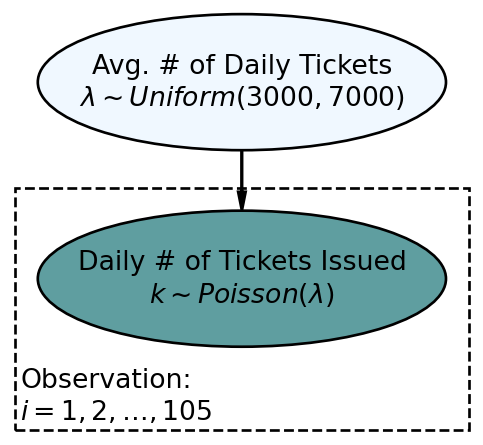
Reproducing the generative DAG in Figure 10.1 in numpyro, we get a posterior distribution:
import xarray as xr
import numpy as np
import numpyro
import numpyro.distributions as dist
from jax import random
from numpyro.infer import MCMC, NUTS
import arviz as az
wedTicketsDS = xr.Dataset.from_dataframe(wedTicketsDF)
wedTickets = wedTicketsDS.numTickets.to_numpy()

## define the graphical/statistical model as a Python function
def ticketsModel(k):
    ## NOTE LAMBDA IS RESERVED WORD IN PYTHON... MUST USE MODIFIED NAME
    lambdaParam = numpyro.sample('lambdaParam', dist.Uniform(low = 3000, high = 7000))

    with numpyro.plate('observation', len(k)):
        k = numpyro.sample('k', dist.Poisson(rate = lambdaParam), obs = k)

# ## computationally get posterior distribution
mcmc = MCMC(NUTS(ticketsModel), num_warmup=1000, num_samples=4000)
rng_key = random.PRNGKey(seed = 111) ## so you and I get same results
mcmc.run(rng_key, k=wedTickets) ## get representative sample of posterior
drawsDS = az.from_numpyro(mcmc).posterior ## get posterior samples into xarray
az.plot_posterior(drawsDS)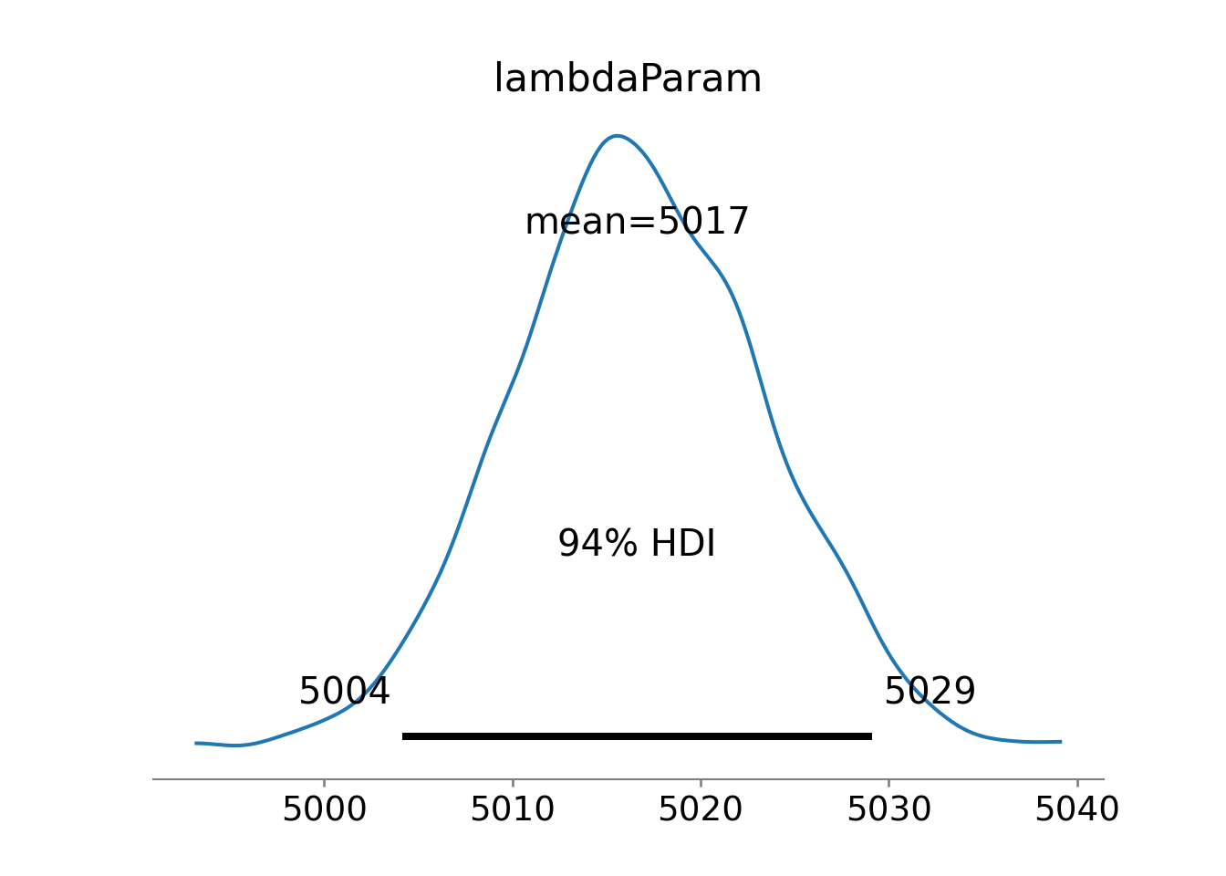
Figure 10.2 suggests reduced uncertainty in the average number of tickets issued,
10.1.1 Posterior Predictive Check
Here we use just one draw from the posterior for demonstrating a posterior predictive check. It is actually more appropriate to use dozens of draws to get a feel for the variability within the entire sample of feasible posterior distributions.
A posterior predictive check compares simulated data using a draw (or draws) of your posterior distribution to the observed data you are modelling - usually represented by the data node at the bottom of your generative DAG. This comparison will either inspire confidence or erode trust in a model. Figure 10.1 suggests that the only uncertainty in the model is in the
In reference to Figure 10.1, this means we simulate 105 observations of tickets issued,
Simulating 105 observations requires us to convert the DAGs joint distribution recipe (Figure 10.1) into computer code - we do this going from top to bottom of the graph. At the top of the DAG is
from numpy.random import default_rng
rng = default_rng(seed = 111)
# drawsDS.lambdaParam is 2-d, i.e. chain and draws are coordinates
# we use flatten to get a 1-d numpy array for input to rng.choice()
lambdaPost = rng.choice(a = drawsDS.lambdaParam.to_numpy().flatten(), size = 1)
lambdaPost.item() ## show just single value5025.0654296875Continuing the recipe conversion by moving from parent to child in Figure 10.1, we simulate 105 realizations of
simulatedData = rng.poisson(lam = lambdaPost, size = len(wedTickets))
simulatedData
array([4948, 5058, 4923, 4957, 5071, 5008, 5168, 5047, 4901, 5029, 5017,
5145, 4924, 5016, 4952, 4959, 4951, 5000, 5089, 5090, 5105, 5037,
4966, 5082, 5002, 5013, 4971, 5088, 4967, 4928, 5071, 4950, 5038,
5057, 5036, 5050, 5054, 5025, 4911, 4964, 5005, 4942, 5002, 4879,
4942, 4902, 5093, 5098, 5048, 4991, 5041, 5071, 5121, 5070, 5110,
4913, 5071, 5011, 5078, 5143, 5034, 5025, 5008, 5059, 5027, 4885,
4985, 5045, 4997, 4965, 4998, 5046, 5114, 5084, 5099, 4915, 4962,
4817, 5022, 4976, 4926, 4907, 5236, 5061, 4982, 4903, 4978, 4883,
4981, 4959, 5038, 4892, 4995, 5109, 5021, 5176, 5090, 4962, 4898,
4973, 4987, 5039, 5085, 5030, 5113], dtype=int64)And then, we can compare the density estimates of the simulated data to that of the observed data:
import matplotlib.pyplot as plt
from matplotlib.lines import Line2D
from numpy import linspace

fig, ax = plt.subplots(figsize=(8, 4),
                        layout='constrained')

# plot density estimate, i.e. estimate of f(x)
az.plot_dist(wedTickets, ax = ax, color = "darkorchid",
             kind = "kde", fill_kwargs={'alpha': 0.5})
az.plot_dist(simulatedData, ax = ax, color = "cadetblue",
             kind = "kde", fill_kwargs={'alpha': 0.5})

ax.set_ylabel('Plausibility Measure: ' + r'$f(k)$')
ax.set_xlabel(r'Daily Issued Tickets  $(k)$')
ax.set_xticks(linspace(0,8000,9))

custom_lines = [Line2D([0], [0], color = "darkorchid", lw=4, alpha = 0.5),
                Line2D([0], [0], color = "cadetblue", lw=4, alpha = 0.5)]
ax.legend(custom_lines,
          ['Density Estimate for Observed Data',
           'Density Estimate for Simulated Data'], loc='upper left')

plt.show()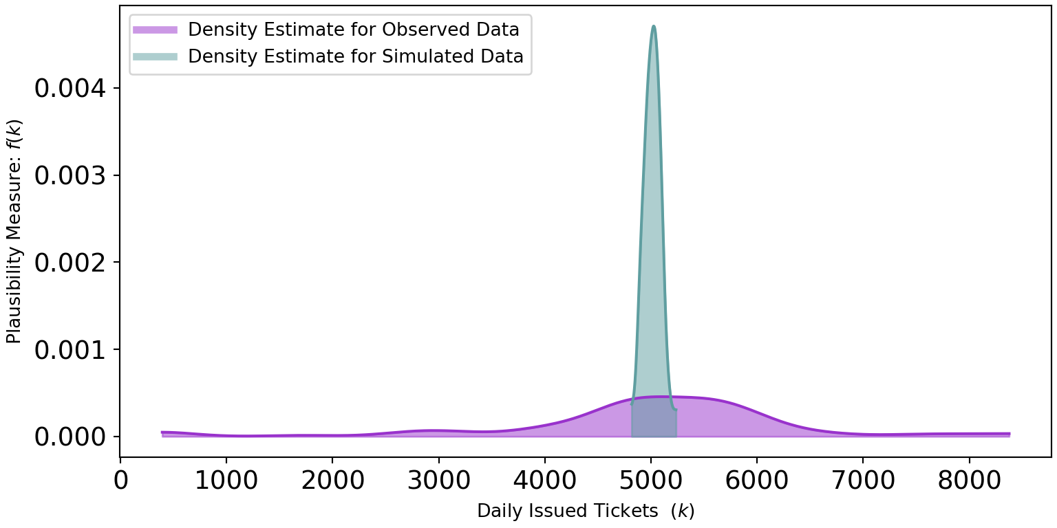
Figure 10.3 shows two very different distributions of data. The observed data seemingly can vary from 0 to 8,000 while the simulated data never strays too far from 5,000. The real-world dispersion is not being captured by our generative DAG. Why not?
Our generative DAG wrongly assumes that every Wednesday has the exact same conditions for tickets being issued. In research done by Auerbach (2017) based off the same data, they consider holidays and ticket quotas as just some of the other factors driving the variation in tickets issued. To do better, we would need to account for this variation.
Auerbach, Jonathan. 2017. “Are New York City Drivers More Likely to Get a Ticket at the End of the Month?” Significance 14 (4): 20–25.
10.2 Posterior Predictive Checks Using Arviz and NumPyro
There is some discretion in choosing priors and advice is evolving. Structuring generative DAGs is tricky, but rely on your domain knowledge to help you do this. One of the thought leaders in this space is Andrew Gelman. You can see a recent thought process regarding prior selection here: https://andrewgelman.com/2018/04/03/justify-my-love/. In general, his blog is an excellent resource for informative discussions on prior setting.
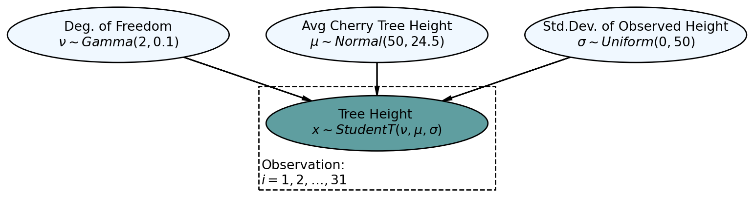
Let’s now look at how a successful posterior predictive check might work while using the more automated tools available to us from the arviz package. Consider the graphical model of Figure 10.4, reproduced here from the previous chapter, which models cherry tree heights:
We get the posterior as usual:
import pandas as pd
import xarray as xr
import numpy as np

#get data
url = "https://raw.githubusercontent.com/flyaflya/persuasive/main/trees.csv"
treeHeightData = pd.read_csv(url).Height.to_numpy()

## define the generative DAG as a Python function
## for posterior predictive checks, we introduce numObs argument
def cherryTreeModelT(x, numObs):
    nu = numpyro.sample('nu', dist.Gamma(concentration = 2, rate = 0.1))
    mu = numpyro.sample('mu', dist.Normal(loc = 50, scale = 24.5))
    sigma = numpyro.sample('sigma', dist.Uniform(low = 0, high = 50))

    with numpyro.plate('observation', numObs):
        x = numpyro.sample('x', dist.StudentT(df = nu,
                                            loc = mu,
                                            scale = sigma), obs=x)

# ## computationally get posterior distribution
mcmc = MCMC(NUTS(cherryTreeModelT), num_warmup=1000, num_samples=4000)
rng_key = random.PRNGKey(seed = 111) ## so you and I get same results
mcmc.run(rng_key, x = treeHeightData, numObs = len(treeHeightData)) # get posterior
drawsDS = az.from_numpyro(mcmc).posterior ## get posterior samples into xarrayNow for a posterior predictive check. Here, we reverse the process from inference to simulation as can be visualized using the generative DAG in Figure 10.5.
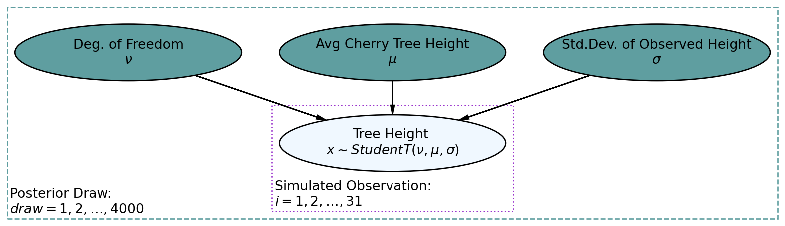
The darker nodes indicate the given variables. We can get these 4,000 draws of the three variables from our posterior distribution using the get_samples() method for the mcmc object:
postSamples = mcmc.get_samples()
postSamples
{'mu': DeviceArray([77.426895, 73.96176 , 77.78146 , ..., 76.10195 , 77.78367 ,
73.91354 ], dtype=float32), 'nu': DeviceArray([27.00458 , 19.97462 , 30.753893, ..., 8.668195, 11.748046,
19.487614], dtype=float32), 'sigma': DeviceArray([4.99349 , 8.3499565, 4.955041 , ..., 6.4903617, 7.1112437,
6.565138 ], dtype=float32)}where the first draw corresponds to Predictive class from numpyro.
More details about the Predictive class can be found in the Numpyro documentation.
The first step is to construct a Predictive object by passing two arguments to its constructor function, 1) the NumPyro function for the model and 2) the draws from the posterior distribution, i.e. postSamples, to be used for generating sample data. Let’s do that now:
from numpyro.infer import Predictive
from jax import random
rng = random.PRNGKey(seed = 111)

## Predictive is a NumPyro class used to construct posterior distributions
cherryTreePredictiveObject = Predictive(model = cherryTreeModelT,
                                        posterior_samples = postSamples)
Once that object is created, you can treat this new object named cherryTreePredictiveObject like a function whose arguments are 1) rng_key: a jax.random.PRNGKey random key used to draw samples, and 2) args: which is all the arguments required for the model (e.g. cherryTreeModelT) to work. This function will return a dict of samples from the predictive distribution. By default, only sample sites not contained in posterior_samples are returned.
## now make posterior predictions - note len(treeHeightData) = 31
## use None for data so that it gets simulated from posterior draws
postPredData = cherryTreePredictiveObject(rng_key, x = None, numObs = 31)
postPredData  ## for each of 4,000 draws,
              ## get 31 simulated observations of cherry tree height
{'x': DeviceArray([[71.21754 , 83.37789 , 86.681915, ..., 82.30624 , 76.630554,
80.43272 ],
[53.74452 , 78.96257 , 90.07705 , ..., 75.01501 , 69.5451 ,
60.684723],
[75.73676 , 75.49854 , 71.70231 , ..., 80.17648 , 76.607796,
90.73639 ],
...,
[74.57809 , 78.87446 , 78.632515, ..., 70.89142 , 83.2702 ,
54.386837],
[83.34909 , 73.676636, 61.385082, ..., 75.37721 , 86.28917 ,
80.84379 ],
[57.31126 , 81.95431 , 68.84223 , ..., 68.4025 , 76.410614,
66.159065]], dtype=float32)}And then, we compare data simulated from the 4,000 random posterior draws to the observed data. Actually, to aid clarity, we will just use simulated data from several draws, say 20, to get a picture of how various posterior densities compare to the estimated density of the observed data. By creating multiple simulated datasets, we can see how much the data distributions vary among plausible posterior values. Observed data is subject to lots of randomness, so we just want to ensure that the observed randomness falls within the realm of our plausible narratives. The below code creates an arviz object and subsequently automates the plotting of the posterior predictive check that we are interested in.
dataForArvizPlotting = az.from_numpyro(
    posterior = mcmc,
    posterior_predictive=postPredData
)
az.plot_ppc(dataForArvizPlotting, num_pp_samples=20)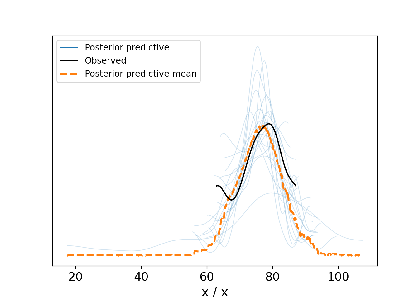
Figure 10.6, a type of spaghetti plot (so-called for obvious reasons), shows 22 different density lines. The twenty light-colored lines each represent a density derived using 31 points of a individual posterior draws. The thicker dark-line is the observed density based on the actual 31 observations. And the dashed-orange line is the averaged density of all the thin light-colored lines. What we hope to see here are strands of the light-colored spaghetti surrounding most of the observed density line. This provides comfort that our model is capable of producing data similar the observed data. As can be seen, despite the variation across all the lines, the variety of posterior lines do seem capable of generating data like that which we observed. While this is not a definitive validation of the generative DAG, it is a very good sign that your generative DAG is on the right track.
You might ask why we use a model at all. The answer there is to understand our data-generating process. As we will see, it is the model that helps extract insight from the data. The data density by itself is really just noise without signal; the model provides justification that we understand something about “how” our data comes to exist.
Despite any posterior predictive success, remain vigilant for factors not included in your generative DAG. Investigating these can lead to substantially more refined narratives of how your data gets generated. Do not be a business analyst who only looks at data, get out and talk to domain experts! See this Twitter thread for a real-world example of why this matters: https://twitter.com/oziadias/status/1221531710820454400. It shows how data generated in the real-world of emergency physicians can only be modeled properly when real-world considerations are factored in.
10.3 Getting Help
As we get closer and closer to the state-of-the-art in data science, the amount of helpful documentation decreases. Using numpyro requires a reading of the documentation while not completely understanding it. Keep iterating towards successively more sophisticated models; go slowly and seek help along the way as needed from your instructor and peers.
10.4 Questions to Learn From
See CANVAS.